

Enterprise telecom uptime dashboard
Solo Client Project | Product Design | Oct 2022
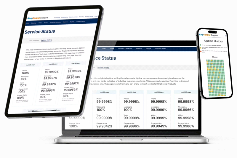
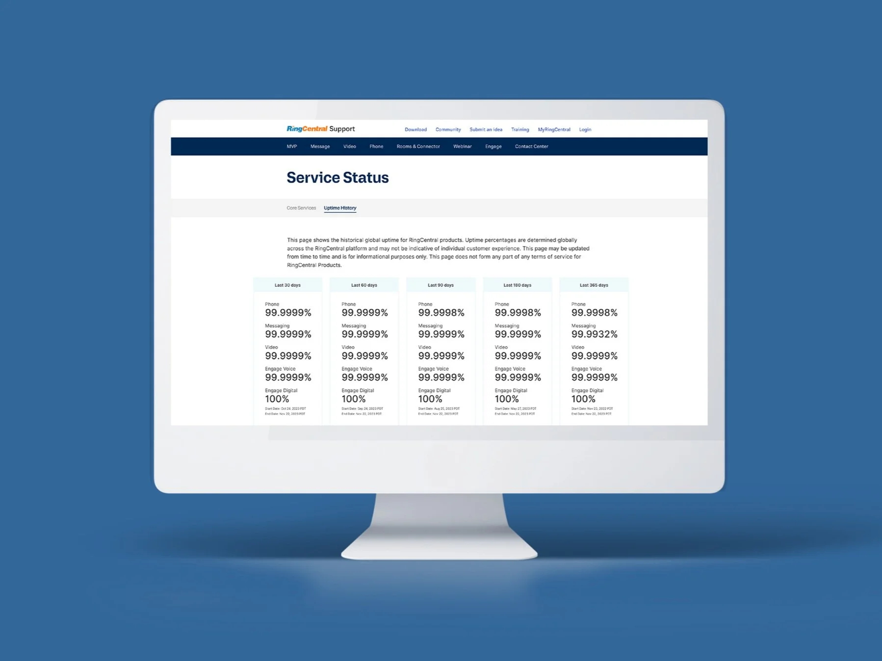
Designed a web dashboard displaying RingCentral's uptime metrics to help potential customers compare performance against competitors—delivered in one day.
Impact: 3+ years live, 2 iterations to production readiness, Immediate stakeholder buy-in
The emergency
RingCentral brought me on to design phone-related features for their telecommunications platform (video calls, phone calls, conferences, messaging). After my first week, the team identified an urgent business problem: despite superior performance metrics, RingCentral was losing customers to competitors due to poor metrics visibility.
I was reassigned to design an uptime dashboard that would clearly communicate RingCentral's reliability advantage. Timeline: one day.
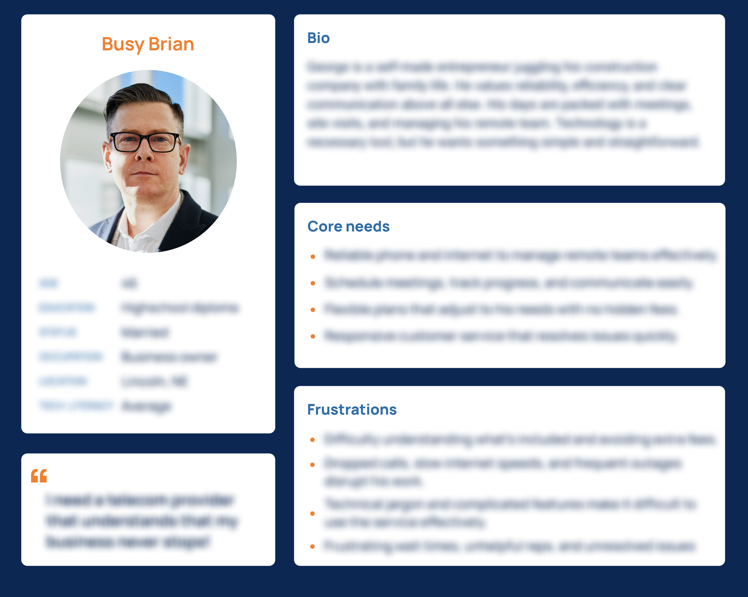
With a one-day deadline, I adapted my research approach. Rather than conducting generative user research, I facilitated rapid stakeholder interviews with executives who had deep customer knowledge. This gave me the insights needed to understand user needs without sacrificing the timeline.
Using these insights, I created the user persona above to guide design decisions for this project and inform future RingCentral work.
(Sensitive information redacted per NDA.)
No time to lose
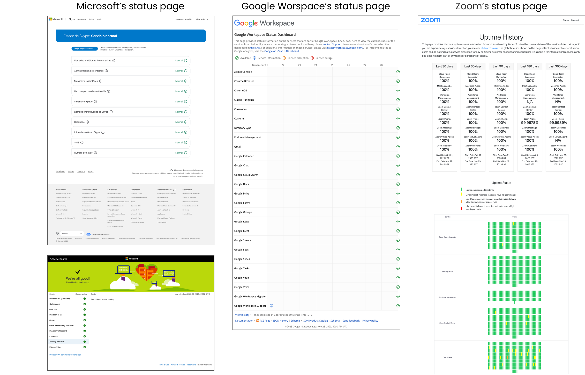
To deliver quality work within the timeline, I conducted lightning demos of competitor uptime pages (Zoom, Microsoft, Google Workspace) to identify proven patterns. Key elements I incorporated:
Color-coded status indicators to communicate severity at a glance
Multiple time intervals (30, 60, 90, 180, 365 days) for quick comparison
Visual day-by-day representation with tooltips for detailed data
Timestamps showing last update to establish credibility
Making the final tweaks
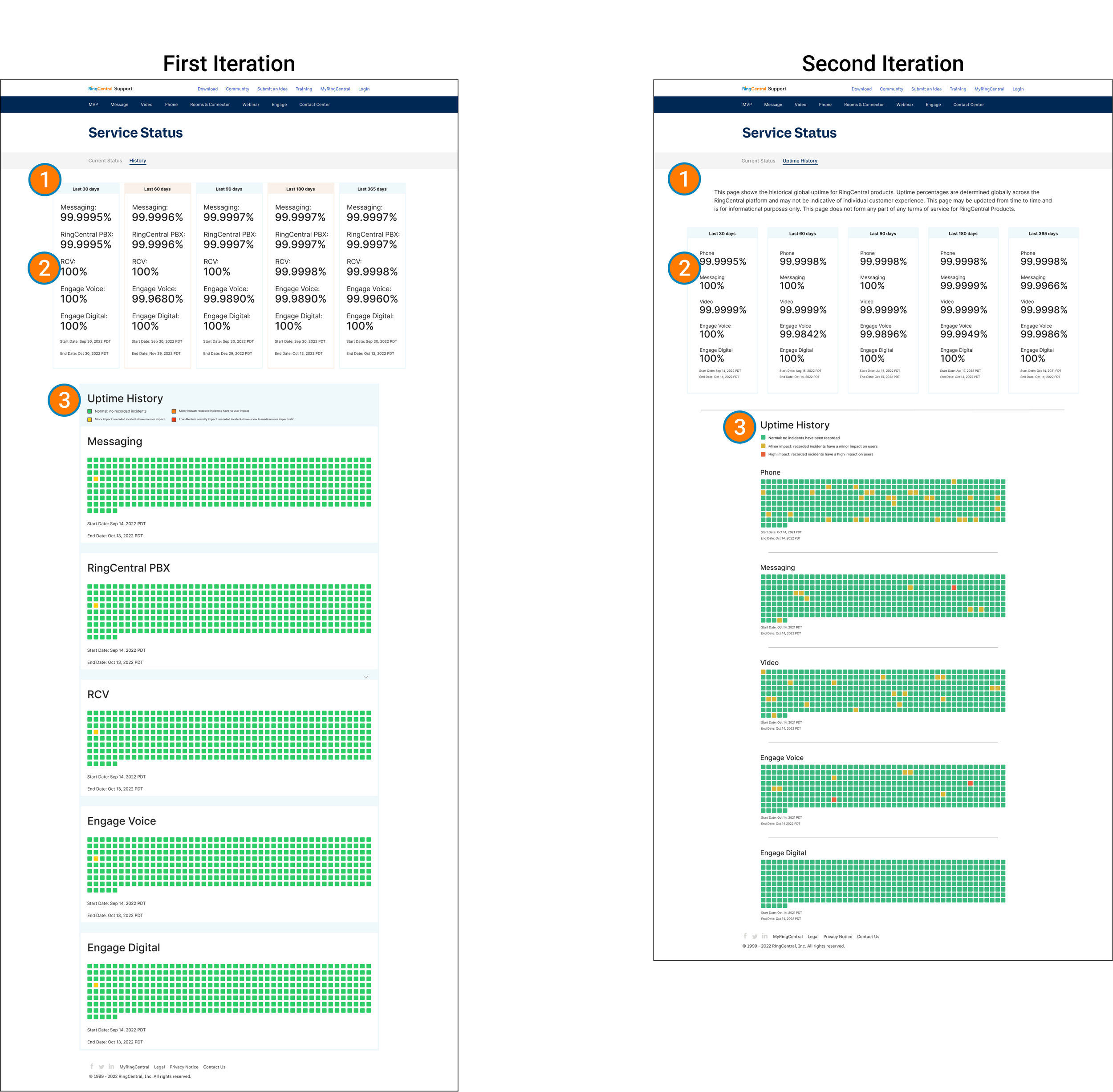
I prototyped the uptime dashboard and presented it to the Director of UX Design and project stakeholders for validation. The design required minimal revisions—confirmation that the rapid research and competitive analysis approach had worked.
Biggest refinements made:
Added compliance language per company policy
Adjusted column colors for visual consistency
Updated product names for broader recognition
Ready for handoff
Following stakeholder sign-off, the development team implemented the design and pushed it live. The uptime dashboard now enables prospective customers to accurately assess RingCentral's reliability compared to competitors, while giving the sales team a data-backed resource for customer conversations.
This project demonstrated my ability to adapt UX process to business constraints without compromising user needs. Working under a compressed timeline, I delivered a stakeholder-approved design using streamlined research methods and competitive analysis.
📍 UPDATE — MARCH 2026
This uptime dashboard is still live and has remained in production for over 3 years without design modifications—validating the rapid research methodology and stakeholder-driven approahc.
The design continues to serve prospective customers and support RingCentral’s sales conversations.
Lessons Learned
Alternative visualization approaches need tested. With more time, I would have designed 2-3 alternative data visualization approaches and conducted usability testing to validate which presentation users comprehended best. The "safe" design choices worked, but testing could have uncovered more effective solutions. I'd also advocate for repositioning uptime data more prominently—currently it's nested in a tab when it should be front and center.
Stakeholder interviews accelerate compressed timelines. When user research isn't feasible, executives with deep customer knowledge provide the insights needed to move forward confidently. Visual communication reduces miscommunication and prevents wasted design cycles. Lightning demos proved remarkably effective for rapid decision-making under constraints.
Behavioral data validates design decisions. Looking back, I would have used more SEO methodologies and Google Analytics to better understand user context. Are they comparing products pre-purchase or investigating during downtime? This behavioral data would validate effectiveness and inform iterations. I'd also design an in-app version—during downtime, the loading screen could display historical reliability data to reassure users.